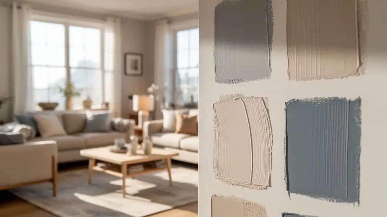
Paint color is the cheapest form of therapy for a small living room. I’ve watched a cramped, cave-like living room transform into a space that felt twice its size — same furniture, same layout, just a different color on the walls. But pick wrong and you’ll make a small room feel like the inside of a shoebox. Here’s what actually works, based on color science and about a decade of watching real rooms change.
The Best Paint Colors for a Small Living Room
The science: why light and cool wins
Color affects perceived space through two mechanisms: light reflectance (how much light bounces off the walls) and color temperature (cool colors visually recede, warm colors advance). For small rooms, you want high reflectance and cool-to-neutral undertones. That doesn’t mean sterile white — it means choosing colors that push the walls outward instead of closing them in.
The winners
Warm white (not stark white). Shades like Benjamin Moore’s White Dove or Sherwin-Williams’ Alabaster have subtle warm undertones that keep a room from feeling clinical while maximizing light. Stark, blue-white paint in a small room with cool light can feel like a laboratory. Warm white is the safest, most foolproof choice in existence.
Light greige. The gray-beige hybrid (think Accessible Beige or Repose Gray) is popular for a reason: it’s neutral enough for any furniture, light enough to open the space, and warm enough to feel inviting. Greige is basically the “can’t go wrong” color of the 2020s.
Pale blue-gray. Colors like Sea Salt or Rainwashed add a whisper of color while the cool undertones actively recede the walls. Blue-grays are magic in small rooms with good natural light — they make the space feel airy and calm simultaneously.
Soft sage green. Muted greens (Clary Sage, Soft Fern) bring nature indoors without darkening the room. They pair beautifully with wood tones and plants, which most living rooms have anyway.
Pale warm gray. If you want a modern look without the coldness of true gray, warm grays with beige undertones keep things contemporary and spacious.
What about dark colors in small rooms?
Here’s the contrarian take: dark colors don’t always shrink rooms. A deep, moody color (navy, charcoal, forest green) on all four walls can blur the boundaries of a small room, making the corners disappear — designers call this the “jewel box” effect. It works best in rooms with great lighting and minimal clutter. But it’s high-risk: get the undertone wrong or skimp on lighting, and you’ve built a cave. For most people, most of the time, light wins.
Rules That Matter More Than the Color Itself
- Paint the ceiling. A bright white ceiling (or the wall color carried up) eliminates the visual “lid” that makes rooms feel low. This matters more than most people realize.
- Use one color throughout. Painting the living room the same color as adjacent spaces erases visual boundaries and makes the whole area feel larger. Accent walls in small rooms usually chop the space up.
- Match trim closely. High-contrast white trim against colored walls creates lines that define (and shrink) the space. Painting trim the same color as walls — or just slightly lighter — keeps things seamless.
- Test with samples. Paint looks wildly different in your room’s light than on a chip. Buy sample pots ($5-$10), paint large swatches, and live with them for 48 hours before committing.
Finishing Touches That Amplify the Effect
Color is the foundation, but these multiply it: hang curtains high and wide (mounted near the ceiling, extending past the window frame) to fake taller windows; use a large mirror opposite a window to double natural light; choose a rug big enough that front furniture legs sit on it (small rugs visually shrink rooms); and keep the rug sized correctly — it’s the most common living room mistake I see.
If you’re repainting anyway, it’s the perfect time to budget the project properly — the same cost principles apply. And for authoritative guidance on low-VOC paints (worth it for indoor air quality), the EPA’s indoor air quality resources explain what those labels actually mean.
Testing Paint Colors: The Method That Prevents Regret
Paint chips lie. They lie because of scale (a 2″ chip can’t show you a wall), lighting (store fluorescents differ from your home), and context (colors shift against your furniture and flooring). The reliable method: buy sample pots of your top 3 contenders, paint 2×2 foot swatches directly on the wall (or on poster board you move around), and observe for 48 hours — morning light, afternoon light, evening lamplight. Colors can look like entirely different paints at different times of day.
Pay attention to undertones in your specific light. That “perfect greige” might read pink in your north-facing room or green under your LED bulbs. Undertones are subtle on the chip and obvious on the wall — which is exactly why the swatch step is non-negotiable. Live with the swatches through a full day-night cycle before deciding.
Consider the finish too: flat hides wall imperfections but marks easily; eggshell is the living-room sweet spot (subtle sheen, washable, forgiving); satin reflects more light (brightening the room further) but shows every wall flaw. In small living rooms, eggshell or satin in a light color maximizes both brightness and practicality.
And the 50% rule: if you’re nervous about a color, it’s usually right. The colors people regret are almost always the “safe” ones chosen from fear — the extra-beige that looks institutional, the gray that reads as prison-chic. The swatch that made you slightly nervous on day one is the one you love on day 300. Trust the swatch, not the fear.
The Bottom Line
The best paint colors for a small living room: warm whites, light greiges, pale blue-grays, and soft sages — high reflectance, cool-to-neutral undertones. Paint the ceiling, keep trim low-contrast, test samples in your actual light, and let the color do the heavy lifting. The right paint won’t just change how your living room looks — it’ll change how it feels to live in.